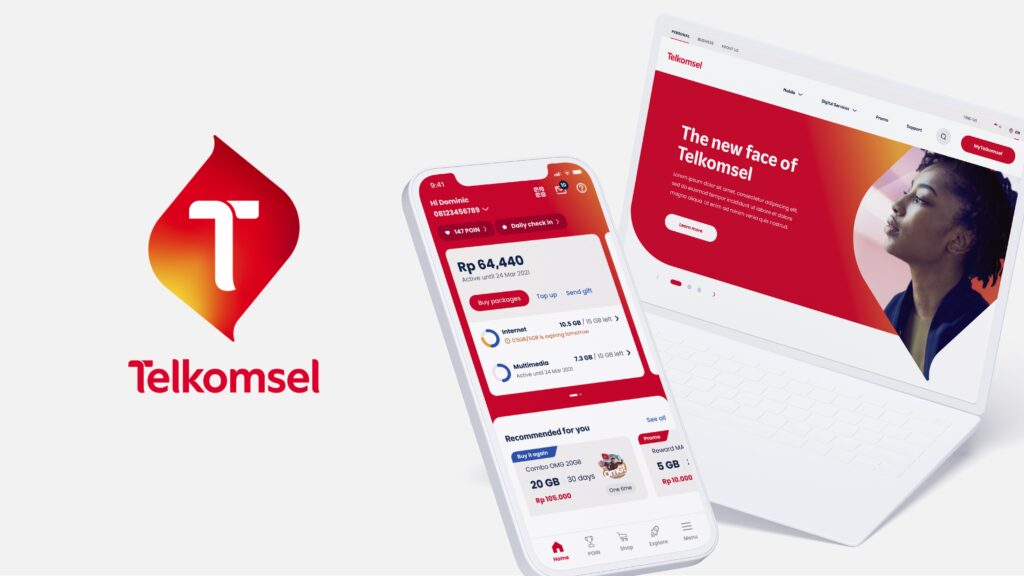
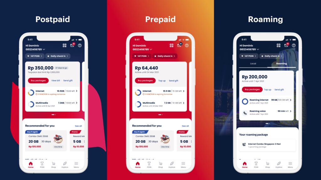
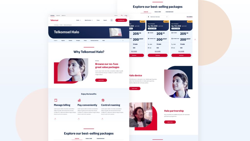
With a new content strategy, visual design direction, and interaction models, Telkomsel rejuvenates its digital presence in the modern world. Grounded in a user-centric approach, the brand has been rejuvenated with a discovery-led website and an action-driven app that helps users make informed decisions with respect to telecommunications.

Grace Gandi Goesantoso, Service and Interaction Designer 1. How has the SG Mark benefited you?
Attaining the SG Mark has been a great encouragement for the team. It acknowledges and validates the rigorous attention and hours we’ve put in and spurs us to continue expanding the possibilities of what design can do. On a personal note, it’s been rewarding to be recognized for a public piece of work — as what we do is sometimes behind the scenes!
2. How do you think your design has impacted users?
One of our goals in revamping the two digital channels was to enable users to make better-informed decisions with ease, as well as provide a more delightful experience. I believe we were able to accomplish that through a combination of visual design and interaction design, resulting in a fresh look on top of recalibrated structures and simpler flows through the platforms. Users should now have less mental load when performing essential account actions, and content prioritizes their needs in context of where they are.
3. What was the most difficult moment when developing your idea?
Creating a new experience for a complex service that has been serving millions while ensuring that it is intuitive and familiar was the biggest challenge for our team. We definitely didn’t nail it on our first try and had many iterations before landing on our final design. It didn’t help that we were doing this project during the peak of the pandemic across multiple time zones and languages!
4. What are some new things you learned about yourself and the users as you were designing?
I became increasingly aware of my biases as a designer. At times, I would apply my own understanding and experience as a telco user to arrive at design decisions. I’ve learnt to constantly check my biases with my teammates and through testing with users to ensure that the final output is universal and accessible.
The process of testing our designs has also made me realise how unpredictable users can be! Some things that seem intuitive to one group might appear inaccessible to others. It’s so important to understand users’ mental models in context.
5. What are your future plans?
I hope to continue deepening my skills and practicing design to serve the needs of people, on projects both big and small!
6. What was the inspiration behind your product/design/idea?
For the website, the team took inspiration from direct competitors as well as indirect competitors (i.e. platforms where people spend the most time every day, such as social media platforms, banking platforms, e-commerce platforms, etc).
For the app, one inspiration was Apple’s Fitness visualizations in the form of rings. Telco packages in Indonesia can get very complex with many granular data categories. The use of the rings helps to elegantly fit more importantinformation about their data usage in one place using a familiar visual concept that can be understood at a glance.
7. Did you experience designer’s block during your work process?
Of course! Balancing user needs, technical feasibility and value for business can be rather challenging and even frustrating at times. Nonetheless, these “boundaries” have pushed our team and myself personally to design more interesting ideas.
8. How do you unwind after the grind?
Drinks after work, working out, and going down many rabbit holes on YouTube.

Like what you read?
Follow us on Instagram, Facebook, Linkedin and Youtube to get the latest updates!
Related Post
